Website
Drieam
Overview
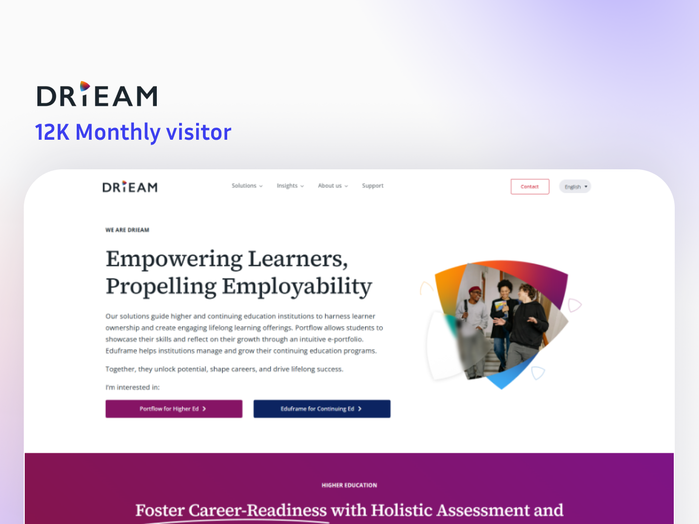
DriEAM is an education technology platform focused on empowering learners and improving employability. The website presents their ecosystem of solutions for holistic assessment, learner portfolios, continuing education growth, and LMS integrations (including Canvas), along with product pages, trust portals, impact stats, and news updates.
The Challenge
1. Explaining multiple products clearly on one website
DriEAM offers different solutions (Portflow, Eduframe, Qualtrics LTI). The challenge was to show what each product does without confusing visitors.
2. Serving different audiences in the same flow
The site must speak to institutions, continuing education teams, and platform decision-makers, while keeping the messaging simple.
3. Strong conversion with clean structure
Visitors need clear CTAs (book demo, learn more, explore products) across the page without making it feel salesy or cluttered.
4. Building trust fast
For B2B education clients, credibility is key—logos, impact numbers, and trust portals must be visible and well-placed.
5. Keeping design premium and consistent
The site needed a modern, professional look with consistent branding, typography, and section layouts across a long scroll page.
Our Solution
1. A clear, section-based landing page architecture
We structured the page into focused blocks: mission/value, key capabilities (portfolio, continuing education), product suite, integrations, trust, and updates.
2. Product-first navigation and discovery
We designed “Our Solutions” cards for Portflow, Eduframe, and Qualtrics LTI so users can understand and explore each offering quickly.
3. Conversion-ready CTAs across key sections
We placed action buttons naturally in the flow (portfolio, continuing education, integrations) to guide users toward demos and product details.
4. Trust-building design elements
We highlighted “200+ institutions” style credibility, impact metrics, partner logos, and dedicated trust portals to reduce hesitation for enterprise buyers.
5. Scalable and consistent UI system
We used consistent layouts, spacing, and visual hierarchy so the site remains easy to expand with new products, news, and additional sections later.
Project Details
Timeline
10 weeks
Key Results
- 12k Monthly visitors
- $10K+ Monthly revenue
Technologies
WordPress