SaaS
Proofhub

Overview
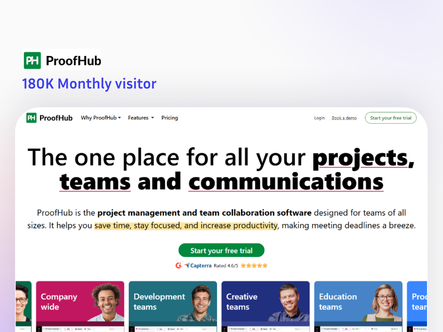
This is a SaaS landing page for ProofHub, a project management and team collaboration platform. The page focuses on a clear value proposition (projects, teams, communication in one place), shows use-cases by team type, highlights key features, builds trust with logos and ratings, and drives conversions through multiple free-trial CTAs, testimonials, and badges.
The Challenge
1. Explaining a broad product in one simple message
Project management tools have many modules. The challenge was to communicate “all-in-one” without overwhelming visitors.
2. Converting visitors into free-trial signups
The page needed strong conversion design: clear CTAs, proof points, and low-friction messaging.
3. Showing relevance for different team types
Marketing, development, creative, education, product teams all need different workflows. The challenge was to show it fits everyone quickly.
4. Building trust for a B2B decision
B2B buyers look for credibility (ratings, enterprise logos, customer stories, badges) before they try a new tool.
5. Presenting features in a scannable way
Features must be easy to skim: icons, short benefits, and visual UI previews.
6. Reducing objections (pricing, complexity, learning curve)
Visitors hesitate due to cost, “too hard to use,” or “too many tools already.” The page needed to handle objections upfront.
Our Solution
1. Strong hero messaging with single clear promise
We structured the top section to instantly communicate the core benefit: one place for projects, teams, and communication.
2. Multiple conversion points with consistent CTAs
We placed “Start your free trial” buttons across key scroll points to capture users when intent is highest.
3. Team-based positioning section
We used a “solutions by team” layout so each visitor immediately sees their use case and the relevant UI example.
4. Trust-building blocks throughout
We added recognizable customer logos, third-party rating highlights, awards/badges, and testimonials to increase confidence.
5. Feature presentation using a clean visual system
We organized features into icons and UI screenshots to make the breadth of the platform easy to understand quickly.
6. Objection-handling section for buyers
We included benefit bullets like “no per-user fee,” “easy to use,” “no juggling tools,” and reliability points to remove friction before signup.
Project Details
Timeline
20 Weeks
Key Results
- 180K Monthly Visitors
- $20K+ Monthly revenue
Technologies
PHP